Improving, by means of design, usability and visual appearance of a responsive web browser Dashboard.
Understand
Initial assessment
Sunmedia's development team reached me out asking for help as regards usability and visual appearance of a web browser dashboard, already working at that time, with very poor design aesthetics and usability. They were in desparate need of help concerning these two main areas: visual design & usability.
A new design layer
Before start working on it I had to first assess current status of the project and properly see the actual needs, as regards design. It was clear pretty soon that it needed a brand new layer of design, keeping structure and functionalities the same.
Usability improvements
Not only design was in need of a brand new look it was also usability. Common UX laws were applied throughout redesign process to help create a more usable and intuitive digital tool for users.
Ideate
Paper sketches
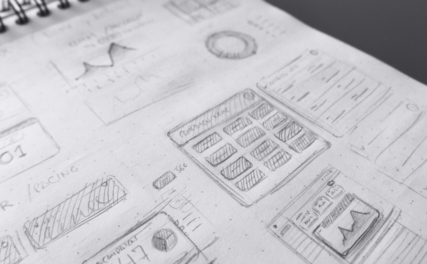
Paper sketch of different approaches
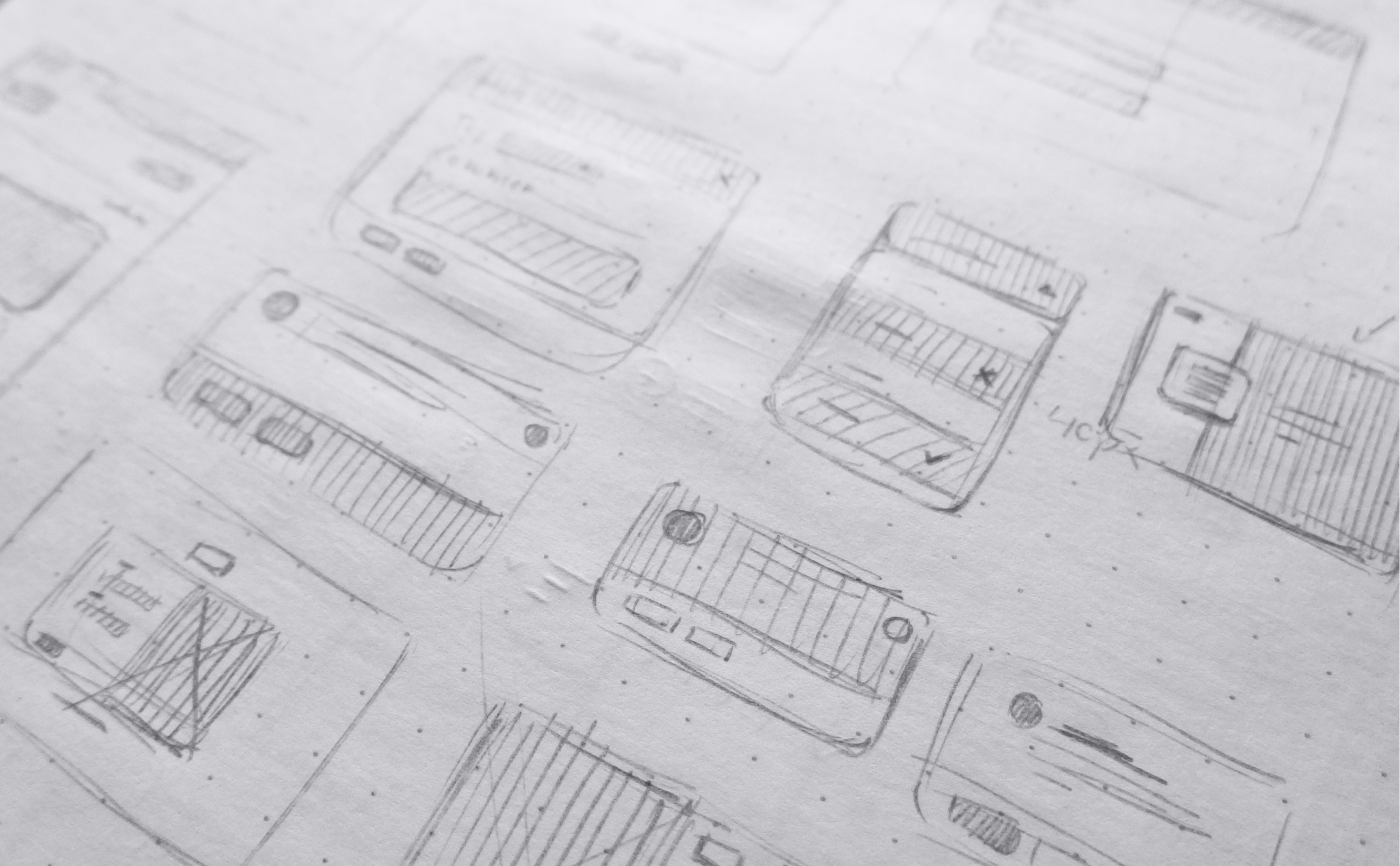
Paper sketch of different approaches
In order to quickly start the ideation process a number of different rough sketches of the overall dashboard structure were made. They quickly allow me to figure out where main elements of the layout should be placed.
Design
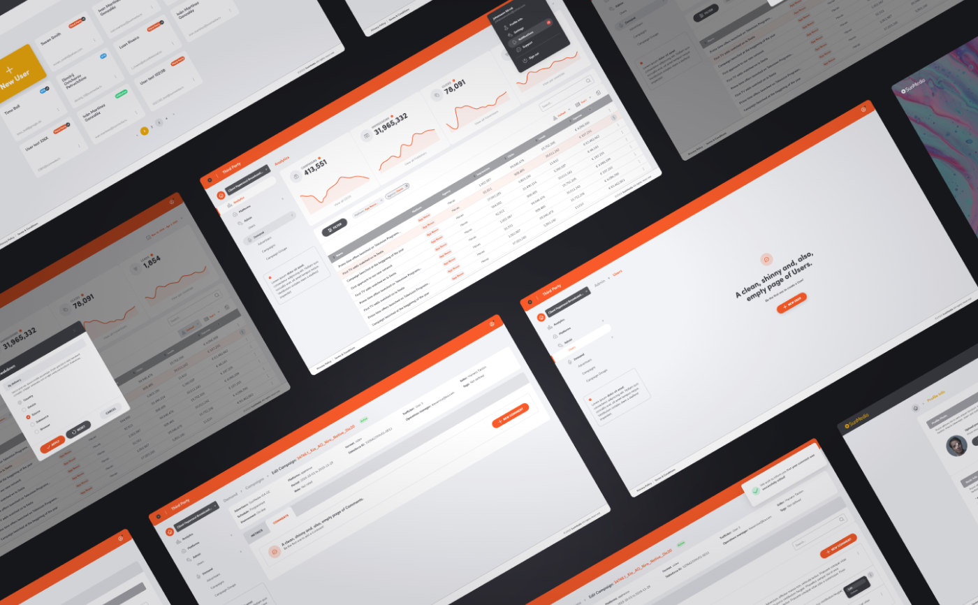
Key Mockups
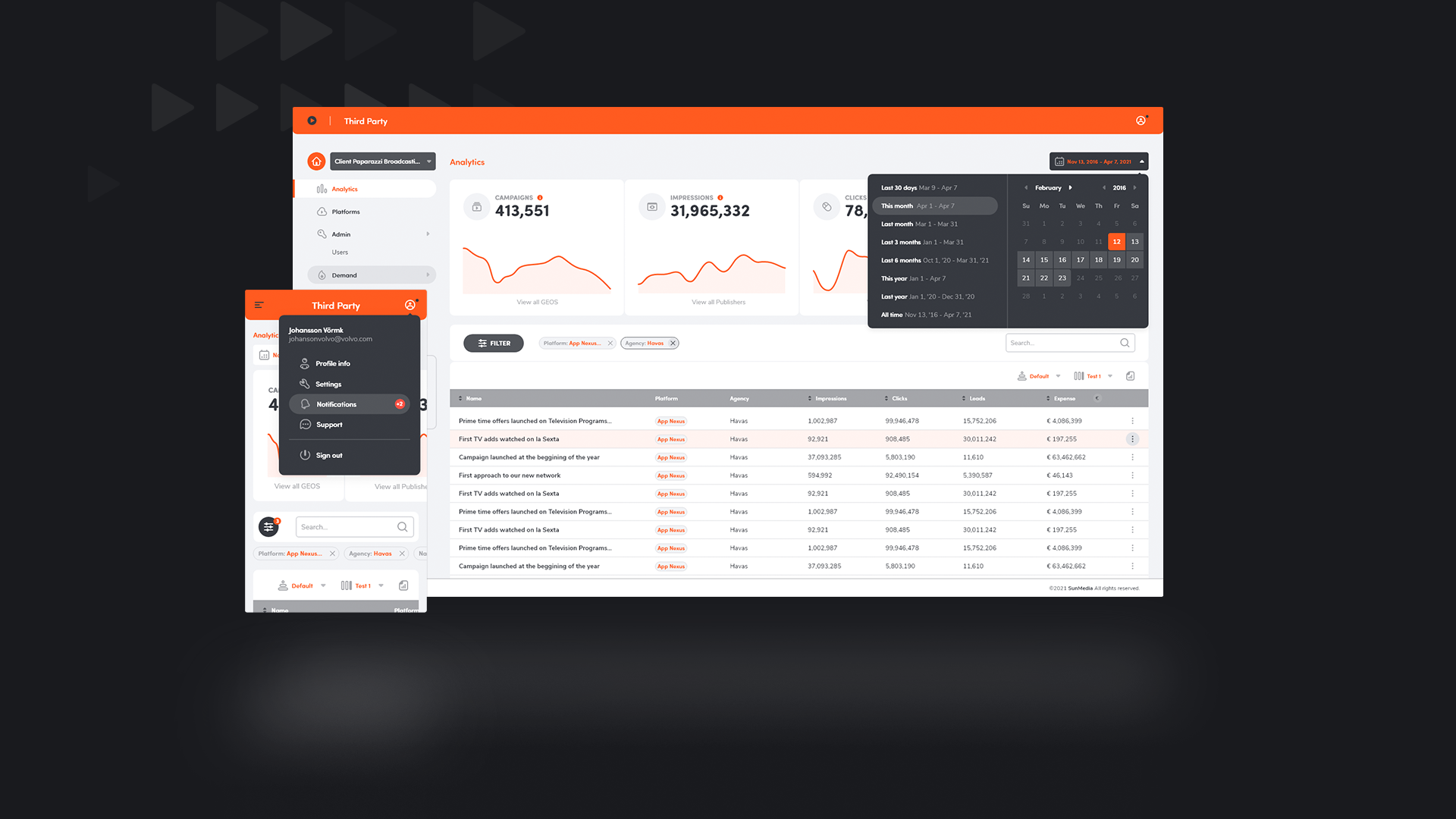
Above you can see a tiny sample (4 different screens) of the end screenshots created; in the end nearly 40 pages were designed. So as to uphold development's team, versions for mobile screens were also created for every single page within the dashboard.
Design
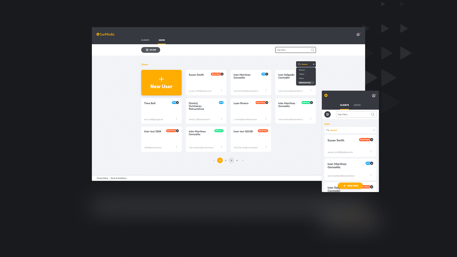
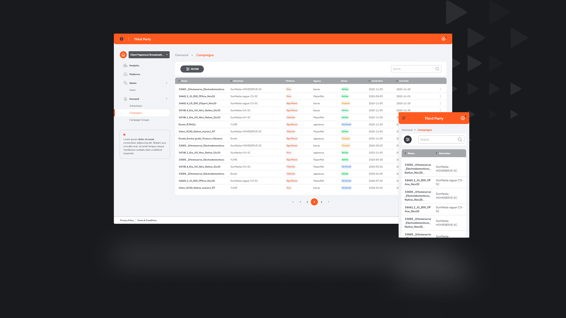
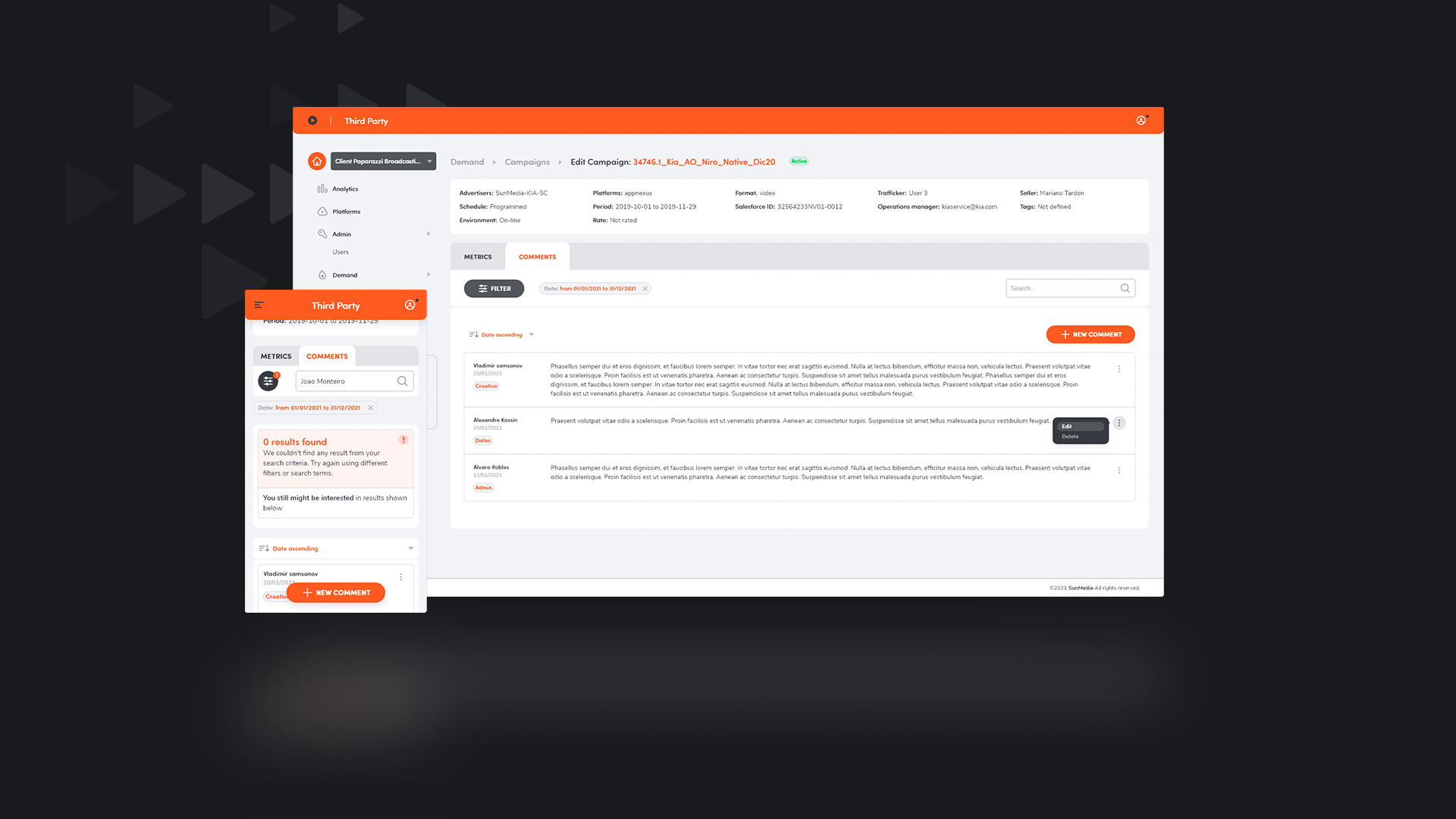
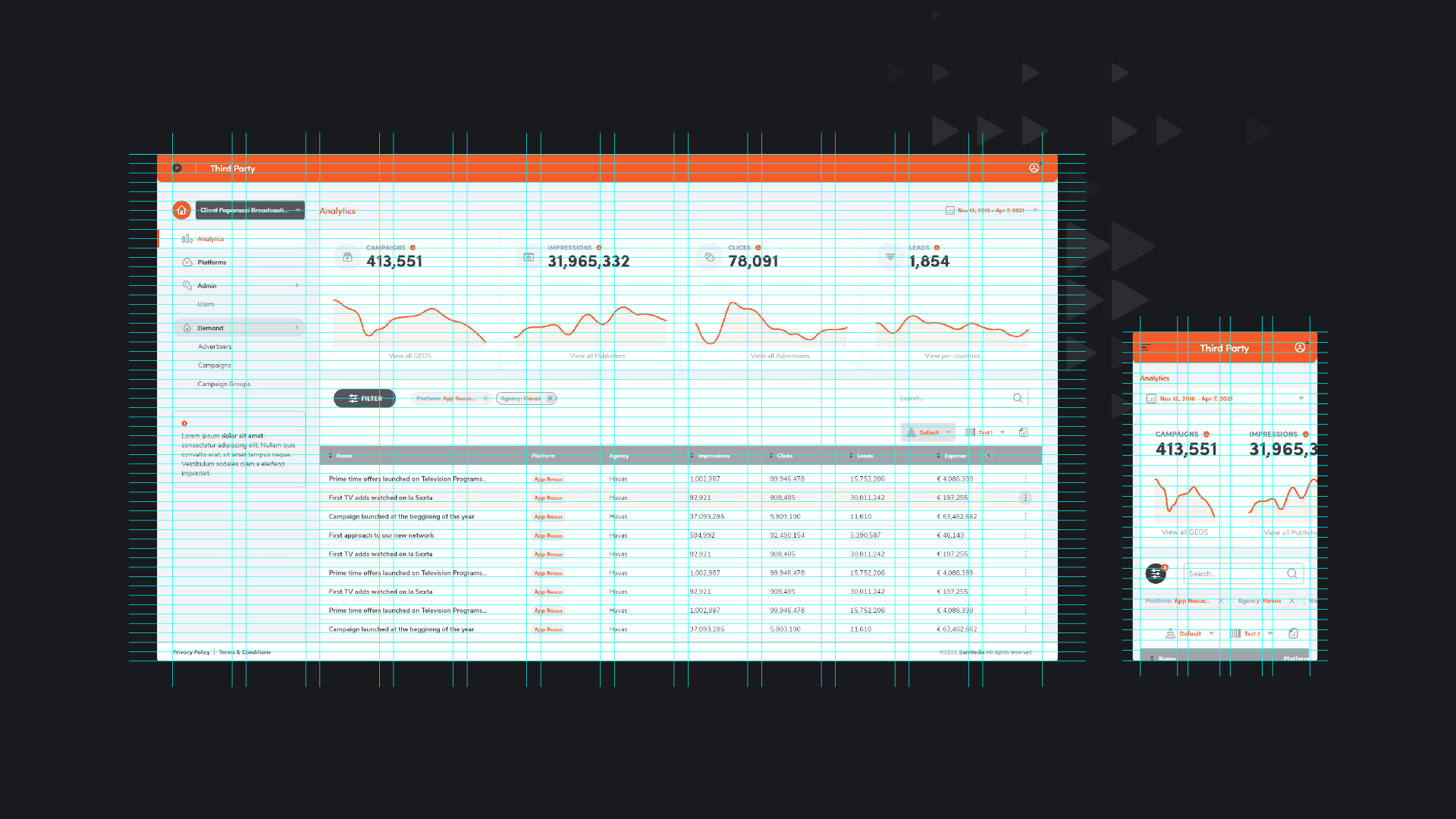
Environments
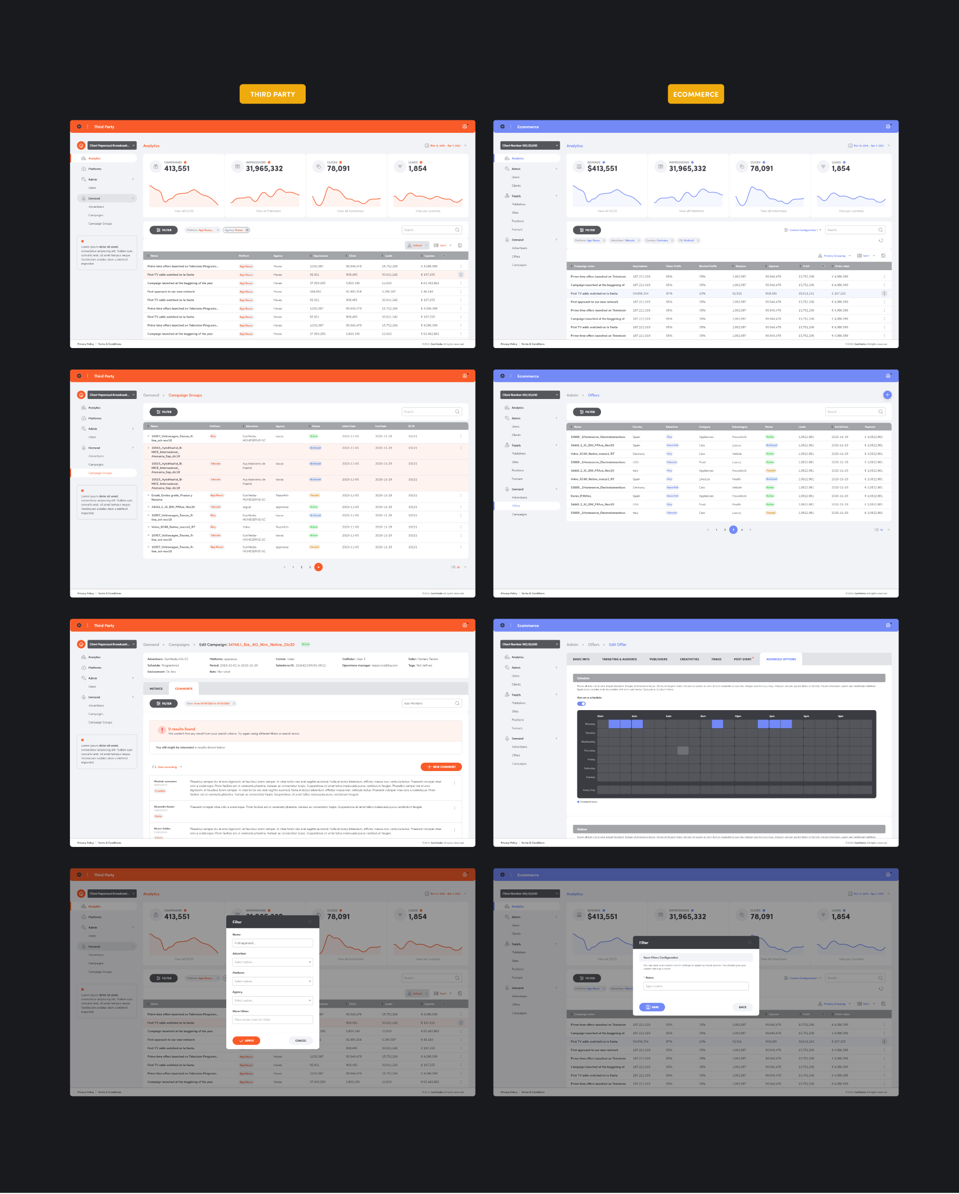
The final layout was planned to be flexible enough to be used for different environments, each of them with their own particularities. Above you can see a few screenshots showing they way the final layout fits every environment needs and pecularities.
Design
Iconography
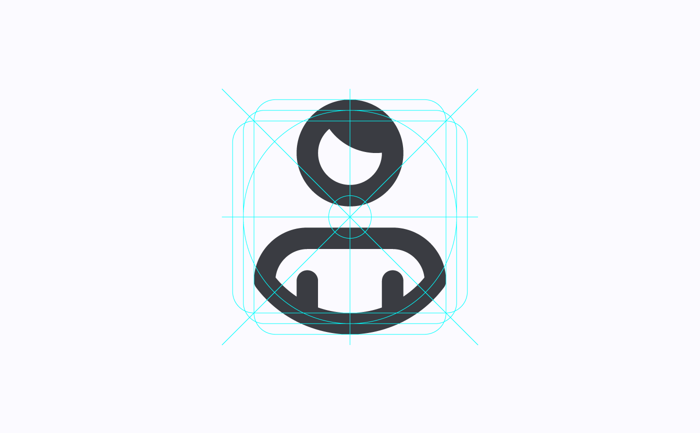
View of the icons' grid
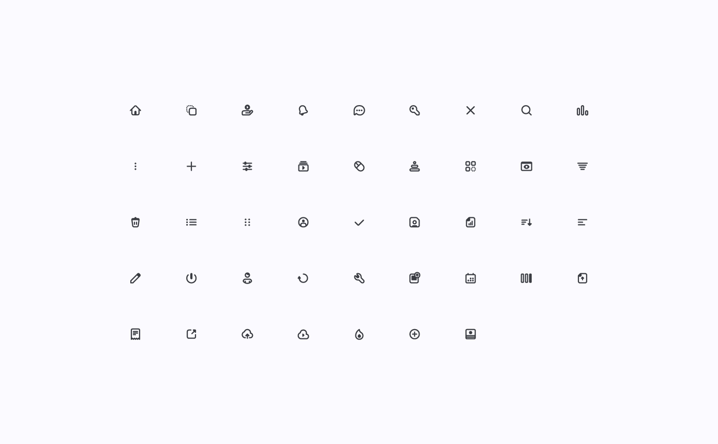
Final set of icons
A set of over 40 customed icons was especially created for this tool. Every icon works well at nearly any size but they were originally created to be shown within a 24x24 pixels grid, which makes even more difficult the labour of creation.
Design
The grid
As a design foundation for desktop screen designs a twelve-column grid was created, its gutter set to 20 pixels.
Take aways
The importance of good aesthetics
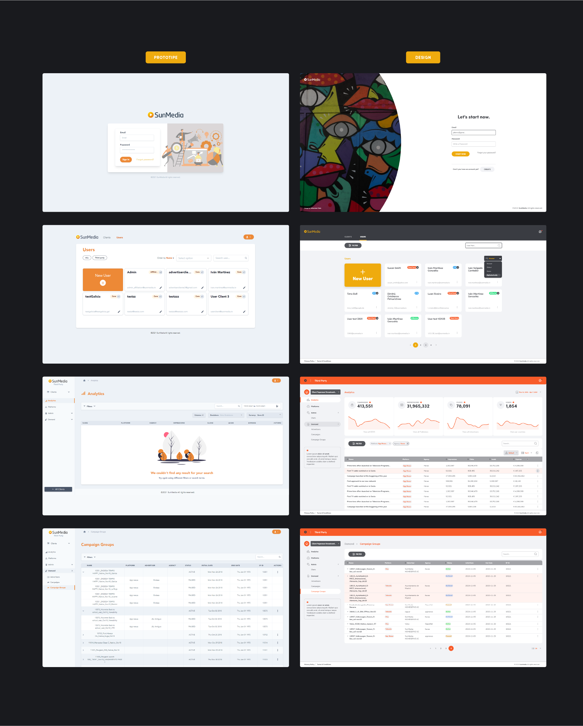
Comparison between different screens, from given prototype to final designs
Good aesthetics and usability are key to succeed in launching a product that looks professional, is easy to use and useful. As soon as the development team shared what they had developed at that time (and was already running), it was pretty noticeable that the result they had achieved needed to be improved, visually and as regards usability.